- Login
- Home
- About the Initiative
-
Curricular Resources
- Topical Index of Curriculum Units
- View Topical Index of Curriculum Units
- Search Curricular Resources
- View Volumes of Curriculum Units from National Seminars
- Find Curriculum Units Written in Seminars Led by Yale Faculty
- Find Curriculum Units Written by Teachers in National Seminars
- Browse Curriculum Units Developed in Teachers Institutes
- On Common Ground
- Publications
- League of Institutes
- Video Programs
- Contact
Have a suggestion to improve this page?
To leave a general comment about our Web site, please click here
Art is Not Just in the Eye of the Beholder But in the Brain
byKimberly K. TurnerIntroduction
Art, be it a painting or sculpture, has the power to move us. As an art teacher, I have always been very interested in having my students appreciate the power of art. I have organized my art curriculum around the concepts of Ernest Boyer. An educational specialist, he advocated making curriculum relevant to students and suggested Eight Human Commonalities that all people share. These are a shared life cycle, creation and use of symbols, aesthetic responses, a sense of time and space, group membership, production and consumption, an awareness and connection to nature, and values and beliefs. I have organized my art curriculum around these universals and their sub—topics, e.g. art sends messages, art is used for celebrations, art communicates identity, and so on.
I focus on the relevance of art, not only in my students' lives but in all cultures and time periods. I want my students to appreciate that all people, from different times and different cultures, have created and used art for the same reasons. These universals help the students to see the world globally, in commonalities, and help them connect the history of art to their experience of being human. I tend to perceive art through a cultural and historical lens, while I know other art teachers who perceive art though an emotional lens. I think most art teachers focus on one or both of these two approaches: looking at the historical and cultural connections in art and/or the emotional, affective aspects of art.
But I have never thought about another human commonality that affects art—-something that connects the experience of all people—-the human brain. People, in general, including myself, tend to think that the feelings inspired by art are in the gut (or the heart or the soul), whatever is deemed by the person the most important part of the body. But the most important body part involved in responding to art is really the brain
I never considered art through the lens of neuroscience. Yet, it is, after all, the brain that controls how we recognize what we see. The brain is the driving force on how the world is seen AND how art is created and viewed. This link between art and the brain is fascinating and I feel students will find it extremely engaging. Even though this science is not being taught as part of art education, I am convinced that it should be, because art and the brain are so intertwined.
Objectives
Students tend to think that images come into the brain fully formed, like a photograph, and that the brain simply receives the image, similar to the way a camera captures an image. To be honest, while I had not given it much thought, this is more or less what I thought as well. But this is not the way it happens. What does happen is an amazing, complicated process. And this is what I'd like to explore with my students, i.e. the basic process of vision, how light enters our retina and then how that information is processed by our brain.
The visual system is part of the central nervous system. It is able to take light that enters through the retina and interpret those signals into a representation of the surrounding world. These signals are sent from the eye along the optical nerve to the visual cortex, which is located in the back of the head above the cerebellum. The primary visual cortex is located in the occipital lobe and is the processing center of vision. There is a widely accepted, but still controversial, theory of how vision is processed. Neuroscience is not in agreement as to how segregated the two systems are or how important the segregation is in our visual processing. This explanation of the two systems is probably oversimplified. Despite these potential limitations, I will focus on this theory with my students in my unit. I believe the students will be able to understand the explanation and begin to think about art through this theory.
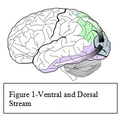
The theory of visual processing purports that as signals leave the occipital lobe, they follow two main channels or "streams". In the occipital lobe, the brain specializes visual information into two distinct pathways: the dorsal stream and the ventral stream (Figure 1). Both streams emerge from the primary visual cortex, in the occipital lobe. The dorsal stream leaves the primary visual cortex and moves to the parietal lobe. The dorsal stream is commonly referred to the "where" system because it is used for processing spatial locations, guidance of actions, such as reaching, and recognizing where objects are in space. It is also known as the parietal stream. The ventral stream leaves the primary
visual cortex, terminating in the temporal lobe. The ventral stream is called the "what" system because it is used for object and form recognition. It has a strong connection to the medial temporal lobe. The medial temporal lobe stores long—term memories. This connection obviously helps with object and face recognition.
I teach in an inner—city middle school, which houses the district's International Baccalaureate Program. The IB program functions as a school within a school and serves gifted students from throughout the school system. Half of my classes are regular classes and half are IB classes. The IB students can select either visual art or a music class; this elective is a yearlong course. I have a block schedule with 90—minute classes; therefore, the students go to art every other day for an hour and a half.
This unit is being created for my 7 th grade classes. I want my students to develop a basic understanding of how vision works: how light is turned into information that is then processed by the brain and how the brain uses different systems to interpret that information. I want them to understand the rules and assumptions that the brain makes and how they effect our perception of the visual world. I also wish for the students to understand the basic workings of the brain and how these rules actually impact art and how we see it. The visual pathways can in fact play games with our perceptions, creating optical illusions.
There will be three main objectives. The students will create three studio projects: one focusing on depth, one on color, and one on the illusion of movement. Although I introduce perspective and illusions of depth techniques in 6 th grade, I plan on revisiting them in this unit. Through the lens of how the brain is involved, we will revisit illusions of depth, focusing on illusions of depth in optical illusions. I will focus on color and will definitely cover the complimentary colors. It would be logical to cover complimentary colors, with afterimages, in this unit. In 7 th grade, there is a state objective on creating illusions of movement. Creating an illusion of movement in a work of art can be approached in a variety of ways, but one of the optical illusions that I plan on highlighting will be illusions of movement. I will focus both on how the brain makes this happen and how students can create an artwork using these principles.
There are three main concepts that I want my students to explore and ultimately understand by the time they finish this unit. First, I want them to understand that seeing (or vision) is not simply the transmission of an image, but is information processing. I want them to understand how the basic vision process works and the two systems of vision. Finally, I want them to understand how artists have, through observation and experimentation, "discovered how to create visual effects that take advantage of how the visual system works". 1
Strategies
While there are a number of ways of approaching or understanding how art and the brain are connected, I have found the work of Margaret Livingstone perhaps the easiest and most logical. Therefore, I am organizing the information parallel to her presentation in Vision and Art: The Biology of Seeing. While I have used a variety of books in my research (see Bibliography), the majority of what I will use with my students comes directly from her work. She has helped coin two terms— the "where" system and the "what" system— to refer to the dorsal and the ventral stream. In this unit, I am using this division of the visual system to organize my unit. The unit will explore the divisions with a studio activity for each system and then a third studio activity that will focus on optical illusions and how they are explained by each of these systems. To gain their interest, I will introduce the unit by showing a variety of optical illusions. I will not go into depth on any of them and will only make sure that the students appreciate the illusion. This will be my "hook" to engage my students. I will explain that by the time we are done, they will understand how all of these illusions work.
I will start my unit with the "where" system, partly because it is the older, more basic of the two systems, and partly because I know the students have a clear understanding of the illusions of depth, and it will make a good bridge that connects their prior knowledge to this new unit. I will introduce how the brain perceives depth via the "what" system and "where" system. I will then focus on the "where" system by using William Hogarth's engraving, Satire on False Perspective (Figure 2). In this engraving, Hogarth purposely breaks the rules of perspective. As a way to review the students' knowledge of perspective, I will ask them to do the same, by creating an image that also breaks the same rules. I assume most will choose a landscape. I feel that middle schoolers will enjoy the opportunity to break rules with permission. I also know that it will require them to understand the rules in order to break them successfully. As a supplemental activity, I will have the students look at M.C. Escher and his impossible worlds. I find that his work engages students: he did a number of famous examples of impossible objects, although most are variations of impossible staircases. Because of the famous aspects of Escher's work, there have been many takeoffs on his work. I think students enjoy seeing how people have used artists' work and played on it.

During the lesson on the "what" system, I will focus on Pointillism (a style of art that uses small dots or points of different colors) and Georges Seurat and his work in color mixing. Although the science of Pointillism may not be correct, it is important because it was the first time that artists cognitively used brain science to drive their art. In addition, it focuses on color theory, and students should understand this fundamental. I am hoping that by exploring color theory through the lens of the brain, it will make it more accessible and logical for my students.
For the final lesson, I will ask my students to create their own optical illusion. At this point, I will use art examples to demonstrate some of the conflicts between the "what" and the "where" systems. I will show a variety of illusions, and have the students figure out why the illusions work and which visual pathway is involved (some will involve both). I will then have the students do an art project that will use complimentary colors and that will create an illusion of movement. This will enable them to do a culminating activity in which they deal with both the "what" and the "where" system.
Background Information
Basic vision
"We see in order to be able to acquire knowledge about this world." 2 Vision is truly an astonishing sense but one of the amazing things is that children are extremely accomplished at seeing before they can even walk. They can construct their world in three dimensions, navigate it, organize and recognize it as different objects and faces, and successfully grasp items. Parents don't teach children how to see and yet children learn to see, despite a fundamental problem with vision: "The image [retinal image] at the eye has countless possibilities." 3 Donald D. Hoffman argues that there are universal rules of visual processing and that these are part of everyone's biology. 4
While vision is not the only way we acquire knowledge about the world, it is the most efficient way. There are certain types of knowledge that can only be acquired through vision, such as face recognition and colors. I imagine that it will come as a surprise to my students that the visual system does not merely send a fully formed image to our brain the way a camera sends an image to film or a computer. Light from an image enters the eye through the lens and travels through the eye to the retina (Figure 3). The light activates the rod and the cone photoreceptors, which then convert that light into an electrical signal that is sent to the brain via retinal neurons. As Margaret Livingstone said in a lecture given at the New York Academy of Sciences in 2006, "The function of the visual system is information processing, not image transmission. There is nobody up there to look at an image". 5

The major visual pathway, the optic pathway, carries the electrical signal from the retina to a specific area of the brain, the primary visual cortex (V1 for short, see Figure 1). There are different types of visual signals sent along this pathway including color, luminance, motion, form, and depth. Once in V1, the signals are passed to cells that are grouped according to what type of signal they receive. These cells are anatomically identifiable. These specialized cells send signals to further specialized visual areas, which are located in the large area of the cortex that surrounds V1. V1, in essence, acts as a distribution center for visual signals and leads to the specialization for each of the specific areas, depending on the type of signals that they receive. 6 Each of the areas has multiple connections with other areas; no area is only a receptor as each both receives and sends signals. In short, light enters the eye and is transduced into electrical signals at the retina and is then processed by a series of specialized parts of our brain. Each area seems to be constructed to extract different kinds of information.
First, the signal is sent to the back of our brain, the primary visual cortex, V1. Then it is sent to the second and third area, each one sequentially closer to the front of the brain. On a basic level, the visual system is one pathway. It goes from the eyes to the thalamus, in the middle of the brain, on its way to the visual primary cortex, located in the occipital lobe in the back of the brain. Then it moves to subsequently higher processing areas that are closer to the front of the brain. On a finer scale, this basic pathway is two distinct but interrelated visual pathways. "The two systems are anatomically distinct but interdigitated, and they carry different kinds of visual information, in parallel, from the retina to various hierarchal processing areas of the brain". 7
When the two interconnected visual pathways hit the primary visual cortex, in the back of the brain, they separate. The dorsal stream takes the information that it processes off to the right, to the occipital lobe, and then to the parietal lobe. The ventral stream takes information to the left to the temperal lobe. So, from the retina to the thalamus and through the early cortical areas, the two pathways are physically connected but they begin to separate at the primary visual cortex and continue to become physically more separated. Throughout these stages, whether physically connected or not, they keep the information that they carry separate.
The "where" system, encoded in the dorsal stream, is how we perceive where things are. This system deals with figure/ground segregations, spatial organization, motion perception and depth perception. It is color blind, in that it does not require any color perception to function. The "what" system deals with how we recognize what things are. This system deals with object recognition, face recognition, and color perception. The "what" system is located in the temporal lobe. The "where" system sees movement, such as a bouncing object, but the "what" system sees fine details such as shape and size. While these are two different systems with different functions and abilities, they function in conjunction with each other. Because of their different abilities and functions, they sometimes create illusions (perceptions that are not accurate) when they work together in a way that the brain does not expect or when they work against each other. This is what creates optical illusions and what some of the artists of the 1960's focused on when creating Op Art.
The two systems—"what' and "where"— are different in the ways in which they process light signals (images). The four fundamental differences are color selectivity, contrast sensitivity, speed and acuity, or resolution. The "where" system is colorblind. The "what" system needs the information about color and uses and carries color signals. The "where" system is sensitive to differences in brightness (contrast) while the "what" system is only sensitive to larger differences (lower contrast). The "where" system is faster, with quicker responses, than the "what" system. And finally, the "where" system has a slightly lower acuity or sharpness than the "what" system.
The major issue with the visual system is that what people see is not a camera image or a simple "looking" at an image on the retina. Therefore, how humans perceive the information that comes in through the retina, the way we actually process what we see, creates many interesting effects, effects that can and have been used in art and in optical illusions. This issue is related to the compression of visual information. We make assumptions, unconscious inferences, and conclusions based on prior experiences and these affect how we perceive the world. Optical illusions are instances when our assumptions or inferences actually go wrong.
Where System
The "where" system is the more primitive of the two visual systems. It deals with information about depth, spatial organization, position, figure/ground and motion. In other words, it deals with all of the aspects that a human or a primate would need to navigate his or her environment. Most animals have only the "where" system although there are a few animals that have both, such as certain squirrels and primates. Humans, as well as most mammals, navigate their environment using this system. People with lesions in this system can lose the ability to see movement, depth, or spatial organization.
Perspective: From 3D to 2D
The "where" system is the part of the visual pathway that is directly responsible for perspective. When we look at the world, we think we see a three—dimensional world. Yet the retina is a flat tissue. This flat tissue is what is sending the visual information to the brain. It is the brain that interprets the flat retinal image into what we perceive as a three—dimensional world. It is ironic that artists have the inverse problem. They must interpret the three dimensional world that they "see" into a two dimensional image. An obvious solution would be to paint the retinal image. But we don't have access to that retinal image. We don't "see" the world until the retinal image has been processed by the brain. 8 Though I previously spent a great deal of time studying and teaching how artists depict depth, before I began doing the research for this unit, I had never considered how the brain effects how we perceive depth. I did not appreciate that artists have discovered techniques to show depth in art that directly correlate to how the brain perceives depth.
I have always enjoyed teaching illusions of depth. In 6 th grade, the students do an important unit on the seven illusions of depth that artists have developed over time. They learn how artists create the illusion of three dimensionality on a two dimensional surface. As an assessment, the students create a painting that successfully illustrates five out of the seven techniques.
The seven techniques are:
1. Size — The larger an object is on a paper the closer it appears to the viewer. The smaller an object is, the further away it appears.
2. Position — An object closer to the top of a paper will appear farther away from the viewer. The lower it is on the picture plane, the closer it appears.
3. Overlap — When one object is put in front of another object, it overlaps. One can tell that the "whole" object appears closer because one can see all of it and the partially seen object is "behind" the front object.
4. Color (also called atmospheric perspective) — Colors in the distance appear to be lighter, more pastel. A good example is mountains seen at a distance appear a light bluish, purplish grey.
5. Details — Objects that are close—up have more details while objects that appear far away have less detail.
6. Shading — This technique works within an object. Lighter areas appear to be closer to the viewer while shaded areas appear farther away.
7. Linear Perspective — Mathematical perspective was discovered in the late 1400s. It deals with vanishing points and converging lines. With my 6 th graders, I introduce linear perspective and they learn how to do simple one point perspective with boxes.
The "where" system is the visual pathway that controls our depth perception. It has six cues that it uses to perceive depth. The brain automatically perceives these cues, even when we are not aware of them. In other words, it is an instinctual, subconscious processing that occurs in the brain without us being cognitively aware of it.
The six cues are:
1. Perspective — Perspective connects to three of the artists' illusions of depth: size, position and linear perspective. It results from the fact that all of the light from a visual scene must pass through one tiny opening in the eye, the pupil. Therefore, objects further away appear smaller and objects closer appear larger. Therefore it effects the relative position of objects. This is also why receding parallel lines always appear converging (linear perspective).
2. Shading — Gradations in light are reflected off an object due the shape of the object.
3. Occlusion — This simply means overlapping. It occurs when objects in the front block or occlude the view of objects that are behind them.
4. Haze — This is also know as aerial perspective or atmospheric perspective. I personally teach the concept as color. This is because, in reality, the intervening atmosphere is what changes the perceived color of distant objects, such as the mountains mentioned before.
5. Stereopsis —This is the perception of depth that is a result of having two slightly different images, one from each eye. The brain receives the slight differences as depth information.
6. Relative Motion — As one moves, the objects that are closer appear to move faster than the objects further away. The trees that are close to us move past us faster than the mountains in the distance. 9
I plan on teaching all six of these cues, noting, however, that there are two that artists typically do not use. Artists typically do not use stereopsis nor relative motion. While artists do use detail, or the lack of detail, to show distance, it is successful not because of the way the brain perceives depth, but rather because our eyes cannot see details in distance.
We will also focus on a variant of perspective, i.e. linear perspective. Because light travels in a straight line and because we only see light that travels in a straight line from an object through the pupil and into the retina, we perceive perspective as linear. It took a long time for this to be understood because our visual systems are so good at instinctually converting perspective information into depth information.
Most people do not consciously see receding parallel lines as converging. 1 0 I have taught linear perspective for years, and have noticed that students either "get" the concept or really struggle with it. I was one of those students who instantly "got" it, when I was taught it in 8 th grade. My best friend at the time, never got it, or at least not during that year, despite many frustrating classes spent trying to make her "see" it. I had always assumed that the differences between the students were simply due to differences in their development. Now, I am aware that it is their brain overriding what they see. This is new information for me and has changed the way I will think about teaching perspective.
Margaret Livingstone has hypothesized that artists who excel at depicting depth might actually be able to do so because they in fact have poor depth perception, thus seeing the world in a flat state, which makes it easier for them to depict it. 1 1 I am not sure I agree with this. My personal hypothesis, based on teaching hundreds of students how to see the world in terms of perspective, is that the students need to be developmentally ready to think about their own vision. As students get older, the ability to do this seems to increase. While maybe 25% of an average 6 th grade class might successfully understand perspective at the end of a unit, in 8 th grade the numbers are closer to 70%. I think it is their level of metacognition, the ability to analysis their own thinking, that makes the difference.
What System
The "what" system is the ventral stream and is the newer vision system in terms of evolution. It is responsible for object recognition, which includes face recognition and color perception. People who have lesions in this system can lose the ability to recognize objects, sometimes even very specific objects like faces, and/or color. This system is concerned with and can be subdivided into form and color. The color sub—system operates at a very low resolution. We have fewer cells in the color system (that is, there are many fewer cells in the retina that detect color than cells that detect light intensity) and those cells have much bigger fields of reception than cells in the form sub—system or in the "what" system. 1 2
Color Mixing
Color mixing that artists do (i.e. mixing paints) differs from color mixing that light does. Color mixing with light is an additive process, while color mixing with pigment is a subtractive process. In other words, when two complementary light colors are mixed, you get white light. 1 3 If you mix two complementary colors of paint you get brown. This occurs because we are not mixing light but in reality mixing the absorbencies of light of each color. When pigment is mixed, the molecules of each color are so physically close that neither individual color is reflected back. If you mix blue and yellow paint, the color reflected back is green because the light is hitting molecules of both colors at the same time. When working on the unit dealing with Pointillism, the students will need to understand this important difference.
Optical Illusions
When both visual systems can see an object, that object will be seen or perceived "normally." This is the case, of course, for the vast majority of things. The object will appear to be "correct", i.e. move appropriately, be three—dimensional and/ or appear to be stable. Problems, or from the point of view of artists, interesting things occur, when the two visual systems are not equal in their response to an object. This is what causes many optical illusions, especially color optical illusions.
Illusion of Movement
For many years, artists have been able to create the illusion of movement. The Impressionists were able to capture a shimmering quality in many of their paintings by using colors that have little or no value or luminance contrast. Value refers to the lightness or darkness of a color and luminance refers to the amount of light emitted or reflected from an object. For purposes of this unit, these terms, in effect, are synonyms. Since the "where" system cannot see the appropriate depth of these colors, the placement of the colors (which are seen by the "what" system) do not have a clear position or stability, and according to the "where" system, appear to jump or shimmer. When high value (luminance) contrast colors are placed next to low value (luminance) contrast colors, the juxtaposition leads to strong illusions of movement. This is what the artists of the Op Art Movement tapped into. Many Op Artists have used this technique, for example, Enigma by Isia Leviant and Bridget Riley's Fall.
Illusions of Depth
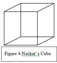
Hoffman states that the fundamental problem of seeing or perceiving depth is that the retinal image is two—dimensional and, therefore, has unlimited possible interpretations in three dimensions. Optical illusions occur when one of two things happen. Our biologically ingrained, subconscious dimensional processing perceives a solution to a visual problem that is in fact incorrect or has more than one possible correct interpretation. We have all seen optical illusions that illustrate the first option, i.e. perceiving a solution that is in fact incorrect (impossible objects are examples). A wonderful example of the second option, seeing more than one possible correct solution, is Necker's cube (Figure 4). Necker's cube is the three dimensional cube that is drawn so that it is see—through. Some people will see only one solution, typically the bottom, left corner is closer to the viewer, but many will find that once they see the two possibilities—either bottom, left corner is closer OR top, right corner is closer, the brain will bounce back and forth with the two equally correct possibilities.
Illusions of Color
I am not planning on focusing on all features of color with my students, because of the complexity of color. But I will deal with two small aspects of color: afterimages and Pointillism. Afterimages are optical illusions that occur when an image continues to be "seen" after the exposure to the original image has ended. For example, if you stare at the TV or a light bulb and then look away, you will see an afterimage of the object for a few seconds. Afterimages occur because of a retinal phenomenon that connects strongly to the color theory that I teach. I teach the color wheel and primary, secondary, warm, cool, analogous, tertiary, monochromatic and complimentary colors.
Five hundred years ago, Leonardo da Vinci wrote that the most pleasing colors are the ones that are opposites, i.e. complimentary colors. Artists have known about and understood complimentary colors for centuries. Yet just fifty years ago scientists discovered opponency, which is when cells in the visual system are excited or inhibited by the opposite color. For example, red is the compliment of green, so red and green are complementary colors. Opponency is when cells in the visual system that are excited by red are inhibited by green and vice a versa, and the same for yellow and purple, blue and orange and white and black. We now understand the biological reason for a phenomenon that artists have understood and used for centuries. 1 4, that complementary colors look brighter and more vibrant when next to each other
Afterimages reinforce what I teach about complementary colors. Afterimages are caused by the eye's photoreceptors. If one stares at an image for a long time, ten to twenty seconds, the photoreceptors become tired from being engaged. Then, when you look away, those photoreceptors that were engaged basically either stop working or send out a very weak signal to the brain. At the same time, the surrounding receptors that were not working are still fresh and are able to send out strong signals to the brain. Thus we "see" the image but in the opposite color. These opposite colors are known as complementary colors and are located across from their mate on the color wheel: i.e. yellow is across from purple, blue from orange, red from green, and, of course, there is also white and black.
The other aspect of color we will be looking at will be that of the work of the artists who worked in the style of Pointillism. While the Impressionists were successful in using the vision pathways to create effects in art works, the artists who worked in the style of Pointillism were the first to knowingly do this. Although there were several artists working in the style, I will focus on Georges—Pierre Seurat. Seurat was greatly influenced by a French scientist, Michel Eugene Chevreul. Chevreul designed the color wheel that is primarily used in art education (there are other versions, but his is by far the most common). Chevreul was a chemist working on restoring tapestries. He realized that he had to take into account the role of surrounding colors to create the dye to replace sections of wool. Through this discovery, he realized that two colors next to or slightly overlapping each other could appear to be a different color, when seen from a distance. This became the basis of Pointillism.
Seurat was fascinated by this idea and set out to prove that the scientific application of color is critical in art. He spent his life trying to prove that tiny dots of colors allow the eye to blend colors optically, creating a more natural state than the blending of colors in paint applied to the canvas directly. Livingstone argues that the techniques of Pointillism do not work because our vision pathways don't work that way. The resulting Pointillist colors are grayish and the pearly effect that many pointillist paintings have are due to larger color dots, which cause the eyes to read them as shimmery. 1 5 While I understand her reasoning, it is hard for me to let go of what I was taught as an art history major: i.e. that Pointillism does work the way it was intended and that our brain does blend the two colors thereby making a new color. Regardless of the science behind it, I want my students to understand this important art history period as the first time that artists began to rationally use the way the brain processes to create effects.
Art History
For centuries, artists have been exploring how we see. In fact, artists have been studying vision longer than neuroscientists. Artists have always been concerned with depicting the three—dimensional world on a two—dimensional surface. In the 14 th century, linear perspective was discovered. Use of color became very important as a tool beginning with the Impressionists, even though they did not understand the science behind the color effects that they achieved.
The "where" system is colorblind and the "what" system sees color and luminance (value). While the "what" system sees a green dot on a red background, the "where" system sees a grey dot on a grey background. Depending on the brightness of the red and green, the "where" system could see the two greys as being identical. When this happens some weird visual effects are created, e.g. shimmering and jittering. The Impressionists were the first to use this effect successfully in art. A wonderful example of this is Monet's painting Impression Sunrise. The sun does appear to shimmer because it is the same value as the background (not lighter as one would expect from the sun). The fauves also used this effect (albeit after the Impressionists) with shadows. They discovered that it really does not matter what color a shadow is as long as it is the right value (the lightness or darkness of a color). If it is the right value, it will create a realistic shadow, which in turn creates a realistic sense of form. An example of this is Matisse's Lady in a Hat, where the colors of the face are completely unrealistic but since the values of the colors are correct, the face retains the correct form. Matisse accomplishes what Picasso did in The Tragedy, Poor People by the Seashore, that is to use value to define reality (form) and color symbolically. Picasso, in fact, said, "Colors are only symbols. Reality is to be found in luminance alone."
Another example in art that shows the contradiction between the "where" and the "what" system is Mondrian's Broadway Boogie Woogie. The painting seems to jitter, or vibrate because the "where" system cannot see the yellow squares but the "what" system can. Since the color is seen but the position is not, they seem to jitter. 1 6
Artists have used depth for thousands of years before the rules of linear perspective were discovered in the early years of the Renaissance. In the early 1400s, Filippo Brunelleschi developed the linear perspective that has been used by artists since. The purpose of perspective to is show objects as they appear, not as they are. Because of this, problems arise. Some artists, once they understood the rules of perspective, began playing with it. An early example of this is William Hogarth's Satire on False Perspective, created in 1754. This image can be classified as an impossible object. An impossible object is an optical illusion that consists of a drawing (or other two—dimensional images) that is instantly, and perhaps more importantly, subconsciously recognized by the "what" system as a three dimensional object even though it is not possible for that object to actually exist. Often the impossibility becomes obvious after considering the object for a few seconds, although sometimes one must consciously examine the object to figure out that it is impossible. M.C. Escher is famous for his impossible objects.
Op Art is a movement that originated in the 1960s, which tried to create an illusion of movement and depth on the picture plane. Op Art became famous in 1965 when the Museum of Modern Art, in New York City, held an exhibition called "The Responsive Eye." While panned by critics, the public loved it and thereby created one of the most popular art movements. Op Art has appeared in everything from fashion and design, from dresses to wallpaper. Perhaps the two most important Op Artists are Victor Vasarely and Bridget Riley.
Once one becomes aware of optical illusions, whether tied to movement, depth, or color, one will begin to see them everywhere. I believe that once one begins to think about how and why optical illusions work, one will never look at them in the same way. And this understanding of how and why they work will open windows to the brain.
Classroom Activities
Introductory Lesson
The classroom activities will be divided between a large introductory lesson and three specialized lessons. The unit as a whole will be introduced by showing the students a variety of optical illusions. I will not explain how any of them work but will use this as a way to engage the students' interest. At the end of the slide show I will ask them to tell me how they think optical illusions work. I will allow them time to brainstorm and write their suggestions on the board. For homework I will ask the students to find an optical illusion that was not shown during class.
The next few class periods will be focused on the brain and how it works. I will start by going over the basic anatomy and function of the brain. Next, we will look closely at the visual system, starting with the eye and how light enters the eye and is turned into signals that are sent to different parts of the brain. Finally, the two different visual pathways will be introduced and the students will create a Venn diagram comparing and contrasting the "what" and "where" systems. For homework, they will have a simple diagram of eye and brain to label.
The "Where" System Lesson
During this lesson, the students will focus on the "where" system. We will look at how the brain perceives depth and how artists throughout time have depicted depth. I will review the seven techniques of illusion of depth that the students learned in 6 th grade. Next, I will introduce, with examples, the six cues that the brain perceives that show depth. The students will, in small groups, match the seven techniques and six cues in order to see the areas in which they correlate. At the end of the class period, for homework, I will give each student a copy of William Hogarth's Satire on False Perspective and challenge them to find as many examples of false perspective as they can and to think about how they might create a picture that "breaks" the rules such as Hogarth's etching.
The next several days will involve the students creating their own picture that will break the "rules" of depth. On 18" by 24" construction paper, the students will draw their landscape, using chalk. I will ask that they create ten things that break the rules of perspective. After they have drawn their image, they will use tempera paint to finish it. To display their work, I will ask them to create an "answer" key that would help viewers find the ten incorrect perspective items. Finally, I will display the students' paintings in the hall, along with their answer keys.
As students are finishing their paintings, I will give them a handout on M.C. Escher. The next class period, I will focus on M.C. Escher and his impossible staircases. I will show clips from the DVD The Fantastic World of M.C. Escher. Using the Internet, the students will look at examples of Escher's work and variations on his work. For homework, I will give each student a blank impossible staircase and challenge them to create their own finished impossible staircase.
The "What" System Lesson
In this lesson, I will introduce the students to how artists have used color and how the "what" system perceives the color effects that artists have used. I will begin with showing images of art that use value (luminance) to create effects. As I show the images, I will ask the students if they can explain the effects using the "what" and "where" systems. I will help if they need it. Some of the images will include Monet's Impression Sunrise, Matisse's Lady in a Hat, Picasso's The Tragedy, Poor People by the Seashore, Mondrian's Broadway Boogie Woogie, Isia Leviant's Enigma and Bridget Riley's Fall.
The next day I will introduce Pointillism and Georges Seurat. I will explain that this school of art illustrates the first time that artists purposely tried to use the way the brain perceives color as a way to achieve effects in artwork. I will explain how Pointillism was meant to work and why it does not. I will then show the classes the first act of Sunday in the Park with George. The following day, I will have the students begin a small (9" by 12") painted landscape using the techniques of Pointillism. I will have the students use a limited palette of colors: red, orange, yellow, blue, green, purple, white and brown. I will not let them use black, as I am concerned that the black will be overpowering in the image.
When the students are finished with their paintings I will show them some images by Roy Lichtenstein, a Pop artist who was heavily influenced by comic books and advertising. In his work, Lichtenstein used Ben—day Dots, a method of printing color that used overlapping dots of limited colors. The students will be able to see the connection to both Seurat and printing. For homework I will have the students create, in their sketchbook, a reproduction of a part of a comic strip using enlarged Ben—day Dots. They will do this using magic markers.
Optical Illusion Lesson
At this point, I will review the two different visual pathways. Next, I will show the students the same slide show of optical illusions that I showed them the first day of the unit. This time, I will ask them to try to figure out how each optical illusion works in terms of the brain and the visual pathways. I hope that they will be able to explain most of the illusions.
I will have each student create an optical illusion of movement. Using a concentric circles and shading, student will use complementary colors to depict movement. By using shading, it will give the appearance of movement. The students will use a compass to create the circles and segments within the circles. This is image is a basic approximation of what they students will create; however they will do it in color. At the end of this unit, I believe the students will have an understanding of how the brain processes vision and how that directly effects art. My hope is that this knowledge will impact how they perceive art in the future.
Endnotes
1 Margaret S. Livingstone, "What Art Can Tell Us about the Brain" (lecture, From Mirror Neurons to the Mona Lisa: Visual Art and the Brain, New York Academy of Sciences, New York, New York, March 22, 2006).
2 Semir Zeki, Inner Vision: An Exploration of Art and the Brain (New York: Oxford University Press, USA, 2000), 4.
3 Donald D. Hoffman, Visual Intelligence: How We Create What We See (New York: W. W. Norton & Company, 1998), 13.
4 Ibid, 13
5 Margaret S. Livingstone, "What Art Can Tell Us about the Brain" (lecture, From Mirror Neurons to the Mona Lisa: Visual Art and the Brain, New York Academy of Sciences, New York, New York, March 22, 2006).
6 Semir Zeki, Inner Vision: An Exploration of Art and the Brain (New York: Oxford University Press, USA, 2000), 60.
7 Margaret S. Livingstone, Vision and Art: The Biology of Seeing (New York: Abrams, 2008), 48.
8 Ibid, 100.
9 Ibid, 100.
10 Ibid, 103
11 Ibid, 103.
12 Jennifer Sutcliffe, "the science of art | seeing in the brain." (Emory University | College of Arts and Sciences | Welcome!) http://www.college.emory.edu/hybridvigor/brain.htm
13 Margaret S. Livingstone, Vision and Art: The Biology of Seeing (New York: Abrams, 2008), 171.
14 Semir Zeki, Inner Vision: An Exploration of Art and the Brain (New York: Oxford University Press, USA, 2000), 3.
15 Margaret S. Livingstone, Vision and Art: The Biology of Seeing (New York: Abrams, 2008), 172—173.
16 Margaret S. Livingstone, "What Art Can Tell Us about the Brain" (lecture, From Mirror Neurons to the Mona Lisa: Visual Art and the Brain, New York Academy of Sciences, New York, New York, March 22, 2006).
Bibliography
Baum, Arline, and Joseph Baum. Opt: An Illusionary Tale (Picture Puffins). New York City: Puffin, 1989.
This is a children's book that introduces several basic illusions. There is not much of a plot but it is a great way to introduce optical illusions. There is a basic explanation of each illusion in the back of the book. The book has been made into a "Reading Rainbow" video.
Cooper, Sharon Katz. How To Fool Your Eyes Leap Through Logic Tease Your Brain and Other Ways to Survive Puzzles. New York: Scholastic Inc., 2004.
This book, geared for students, is filled with activities such as puzzles, optical illusions and other brainteasers.
Gregory, Richard L.. Eye and Brain. Princeton: Princeton University Press, 1997.
This is a classical text on vision and perception. While it is very scientific, it comes at the topic more from perception than neurology but is interesting and valuable.
Hoffman, Donald D.. Visual Intelligence: How We Create What We See. New York: W. W. Norton & Company, 1998.
This is a fantastic book that I highly recommend to an art teacher. It delves into "rules" that the brain has that deal with how the brain perceives things that are seen.
Illusionworks. Amazing Optical Illusions. Toronto: Firefly Books, 2004.
This children's book shows many classical illusions done in a more contemporary way. It is visually engaging and has simple explanations.
Jennings, Terry. 101 Amazing Optical Illusions: Fantastic Visual Tricks. New York: Sterling, 1998.
This contains a variety of illusions that students or teachers can create or replicate, including afterimages, impossible objects and stroboscopes.
Jensen, Eric(Author). Arts with the Brain in Mind [ARTS W/THE BRAIN IN MIND —OS]. Alexandria, VA: Association For Supervision & Curriculum Deve, 2001.
While this doesn't really focus on how the brain perceives art, it does focus on why the arts are so important in brain development of students. It is a wonderful advocacy tools that all arts teachers should have.
Livingstone, Margaret. "What Art Can Tell Us about the Brain." The New York Academy of Sciences. http://www.nyas.org/brainart (accessed July 7, 2009).
This website has the lectures given by a variety of people, neuroscientists, psychologists, and artists, at a conference on the brain and art. If one is interested in learning more about different aspects of the relationship between the brain and art, this would be a good starting place.
Livingstone, Margaret S. Vision and Art: The Biology of Seeing. New York: Abrams, 2008.
This is the book that I use as the basis of my unit. If I could only recommend one book, this would be it. It explains the science in a very clear, understandable manner.
Livingstone, Margaret. "What Art Can Tell Us about the Brain." From Mirror Neurons to the Mona Lisa: Visual Art and the Brain, New York Academy of Sciences, New York, New York, March 22, 2006.
Luckiesh, M. Visual Illusions: Their Causes, Characteristics & Applications. New York: Dover, 1965.
It is a wonderful resource that discusses broad categories and specific examples with very complete explanations
Parker, Steve. Brain, Nerves, and Senses (Understanding the Human Body). Milwaukee: Gareth Stevens Publishing, 2004.
Focusing on very basic information on the brain, nerves, and the five senses, this children's book is not focused much on vision but is a good general resource for the classroom.
Seckel, Al. Masters of Deception: Escher, Dali & the Artists of Optical Illusion. New York: Sterling, 2007.
This is wonderful book of optical illusions in art. While weak on information, it is a fantastic source of images to use in your classroom.
Seckel, Al. The Great Book of Optical Illusions. Toronto: Firefly Books, 2005.
This title is filled with over 250 optical illusions, most in color. It is a wonderful book to share with students but it does not explain the illusions.
Solso, Robert L.. Cognition and the Visual Arts. London: The Mit Press, 1996.
Another wonderful book, this is about how we perceive, process and store visual information in relationship to art. It is another book that I highly recommend.
Sturgis, Alexander. Optical Illusions In Art: Or—-Discover How Paintings Aren't Always What They Seem to Be. New York: Sterling, 1996.
Focusing on art, this book shows illusions in art. It shows opt art, optical illusions, trompe l'oeil, perspective images and several other types. It is a great resource for an art classroom.
Sutcliffe, Jennifer. "the science of art | seeing in the brain." Emory University | College of Arts and Sciences | Welcome!. http://www.college.emory.edu/hybridvigor/brain.htm (accessed July 7, 2009).
This a short, three pages, article that summarizes Margaret Livingstone's work on the "what" and "where" system.
"The Official M.C. Escher Website." The Official M.C. Escher Website. http://www.mcescher.com (accessed July 12, 2009).
This is an amazing website with a great deal of information on M.C. Escher. The best part is the 3D multimedia section that "flies" a viewer around three of his works.
Tytla, Milan. You Won't Believe Your Eyes!. Toronto: Annick Press, 1992.
Geared for children and/or teachers, it provides many projects and activities to do related to vision, including optical illusions, making a paper maiche eyeball, making a prism, etc. It would be a worthwhile addition to a classroom.
Unruh, J. Timothy. Impossible Objects: Amazing Optical Illusions to Confound & Astound. New York: Sterling, 2002.
This has a large number of black and white impossible objects with very basic explanations on how they were created.
Westray, Kathleen. Picture Puzzler. Cookery: Houghton Mifflin Books For Children, 1994.
This children's book introduces classic illusions that are explained in a child friendly way, albeit very simply.
Zeki, Semir. Inner Vision: An Exploration of Art and the Brain. New York: Oxford University Press, USA, 2000.
This is a wonderful, fascinating book on how the brain perceives art. While perhaps parts of it is a little too scientific, it is written in a way that even a layperson can understand.
Art and the Brain (Journal of Consciousness Studies: Controversies in Science & the Humanities). Charlottesvile: Imprint Academic, 1999.
An interesting collection of article and responses, this book has 4 main articles and then responses to each. While it is rather scientific, it is very interesting. There is a part 2 and part 3.
Sunday in the Park with George. DVD. Directed by Terry Hughes. 1986; Hollywood: Image Entertainment.
This wonderful film version of the Broadway play depicts Georges Seurat during the time when he was working on the painting, Sunday Afternoon on the Isle of La Grande Jatte. While the second act is entertaining, I would not show it to the students. The first act is truly outstanding and a wonderful way to introduce Seurat to students.
The Fantastic World of M. C. Escher. DVD. Directed by Michele Emmer. 2006; Silver Spring, MD: Acorn Media.
This 50—minute video introduces the life of M.C. Escher and some of his work. While perhaps not the most engaging film, shown in segments it would be valuable for students to see.
The Private Life of a Masterpiece: Impressionism and Post Impressionism. DVD. Directed by Jeremy Bugler. 2003; n/a: Bbc Warner.
This is a wonderful series that look at individual art images in depth. A teacher will want to preview what is shown to students because there may be some images or information that might not be suitable for certain age groups or populations.
Comments (0)
THANK YOU — your feedback is very important to us! Give Feedback