Content Objectives
Introduction and Rationale
Imagine asking your students the following sequence of questions in class: What does it mean to be healthy? What does it mean to be unhealthy? How much of your health is under your own control? How does your family affect your health? How does your environment affect your health? How does your socioeconomic status affect your health? What are the major health problems you may face in your lifetime? How can we predict and prevent these future health problems?
I imagine the answers in your classroom would be as varied as those I would find in my own; some would be very encouraging, some very disheartening, and a select few would be very comical. As educators of any discipline, we find it imperative that we further our students’ understanding of and control over their own health through probing questions such as these and the subsequent lessons we teach to address these issues
As a mathematics educator, I also find it imperative that I inspire in my students an appreciation for mathematics and the power it gives us in understanding and communicating about the world around us. Too often students see math as an intimidating set of rules and processes that have little to no relevance in their daily lives. Even when you encounter the few individuals who are self-proclaimed “math people,” they are not always able to see the connections math has to the world around them, let alone the impact a thorough understanding of mathematical processes can have on their own quality of life.
Through this unit, I intend to provide enriching opportunities for students to practice and apply core statistical methods while exploring health in their hometown of Chicago. It is my hope that this unit will allow students to see mathematics as an accessible, integral component to not only their academic studies, but also to understanding and communicating information in their daily lives. I hope that this unit will serve as a springboard for discussion as to how students can take better care of their own health and also be advocates for better health in their families and communities.
School Profile
Back of the Yards College Preparatory High School is located on the southwest side of Chicago and is entering its third year of serving both the Back of the Yards neighborhood students as well as students from surrounding neighborhoods through our International Baccalaureate (IB) Program. All students engage in the Middle Years Program in 9th and 10th grade, a program that aims to push students to become more internationally minded, well-rounded students through specific interdisciplinary connections and rigorous curricular components. Students then have the opportunity to apply to the Diploma Program (DP), Career Program, or Subject Certificate courses for their 11th and 12th grade studies as part of the IB Program. Each of these programs works to continue to build IB learners who are inquirers, knowledgeable, thinkers, communicators, principled, open-minded, caring, risk-takers, balanced, and reflective1. Our student body is approximately 85% Hispanic, 7% Asian, 5% African American, and 3% White. Almost all students (99%) come from a low-income family. Approximately 11% of our students have disabilities and 24% of our students are English Language Learners10. There are definite health struggles within these specific communities that we will examine through this unit.
Course Profile
This curriculum unit is being developed as the first unit of the year for my two sections of 11th Grade DP Mathematics. The prerequisites for this course are high school Algebra I, Geometry, and Advanced Algebra with Trigonometry. All of the students in these two sections will be concurrently enrolled in 11th Grade DP Biology. I will have numerous opportunities to collaborate with the 11th Grade DP Biology instructor, and thus we will be able to build many interdisciplinary connections throughout this unit and subsequent units. The statistical methods we focus on in this unit will serve as a foundation both for this mathematics course as we build into more complex modeling scenarios, and for laboratory work in the 11th Grade DP Biology course. In addition, the 11th Grade Biology topic sequence will expose my math students to the biological underpinnings of health and disease in order to give them a deeper understanding of the science behind this initial unit. While this unit is developed for a rigorous, accelerated 11th grade mathematics course, components of this unit can be used at all levels of high school mathematics study, as well as in secondary science studies, particularly biology. The timeline for this unit as it stands is approximately five weeks of five 50-minute class periods (or roughly 20 instructional hours).
Background Information
Statistical Methods
Students will gain proficiency in mathematically summarizing data sets, and they will use these mathematical summaries to make logical predictions and informed decisions about health-related issues in their hometown. The statistical methods we will study in this unit will fall into one of three categories: measures of central tendency and dispersion, measuring frequency, and linear correlation2. The section below aims to provide an overview of the statistical methods necessary; for the scope of this class, students will not be expected to calculate certain measures by hand (i.e. standard deviation) but instead they will use technology. Thus many formulas have been omitted, though they will be discussed in class.
Measures of central tendency and dispersion are integral in understanding the average and the distance from the average within a data set. There are three main measures of central tendency: the mean (the sum of all data values divided by the number of data values), the median (the middle number of a data set when values are arranged in ascending order), and the mode (value occurring most frequently in a data set). Similarly, there are three measures of the spread of a data set: the range (the distance between maximum and minimum values of the data set), the interquartile range (the distance between the lower quartile and the upper quartile), and the standard deviation (the average distance of data values from the mean – we will primarily use technology to calculate this measure). It is important to note that outliers are found by identifying data points that are 1.5 interquartile ranges (IQRs) away from the median. There are distinct advantages and disadvantages to each measure in summarizing a data set, as detailed in Table 1 below.
Table 1: Advantages and Disadvantages of Measures of Central Tendency and Dispersion
|
Measure |
Advantage |
Disadvantage |
|
Mean Range Standard Deviation |
Gives “big picture” of the data set by considering all data values |
Can be inaccurately distorted as a result of outlier values |
|
Median Interquartile Range |
Unaffected by outlier values |
Can omit some of the “big picture” of the data set by not representing all data values |
|
Mode |
Useful for qualitative data sets |
Can have multiple values |
Particularly when dealing with large data sets, as we often are in the realm of health, we create tables and diagrams to measure the frequency of occurrence of data values instead of listing all data values in a set. Frequency tables are useful in identifying the number of occurrences of each exact data value. The mean and standard deviation of a data set can also be calculated directly from a frequency table. In addition, we use frequency tables to group data into appropriate intervals. While we may lose some level of detail in such tables, they are incredibly useful in summarizing overall patterns and trends in data. We use the mid-interval value (the mean of the upper and lower interval boundaries) to calculate mean and standard deviation in these cases. In order to calculate median and quartiles of a frequency table, we construct cumulative frequency diagrams; cumulative frequency represents the running total of all frequencies up to a certain data value. Cumulative frequency diagrams are essentially graphs of the data set that detail the data values along the x-axis and cumulative frequencies along the y-axis. We can graphically estimate medians and quartiles from these curves. Box-and-whisker plots are also a useful diagram in representing the center and spread of a data set, and they are helpful in visualizing outliers. The final diagram we will use in representing frequency is a histogram. Histograms communicate the distribution of the data set and are similar to bar graphs. Histograms, however, are used uniquely for sets of continuous data, and the size of each bar must be representative of the frequency of each data value (bar graphs, on the other hand, are used for discrete or qualitative data sets and the size of each bar does not necessarily convey the frequency of the data value). Table 2 below provides examples of each of these frequency diagrams constructed from TI-84 Plus Emulator software (similar to what will be utilized in class) using my own sample set of data.
Table 2: Examples of Frequency Diagrams
Initial Data Set representing heights in meters of 20 students:
{1.52, 1.58, 1.63, 1.63, 1.65, 1.68, 1.68, 1.68, 1.72, 1.73,
1.76, 1.76, 1.80, 1.81, 1.82, 1.85, 1.90, 1.93, 1.97, 1.99}
|
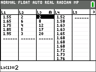
Frequency and Cumulative Frequency Table with 5 intervals of width 0.1
Note that the mid-interval value is used for each interval of width 0.1 in column L1, the frequency of data values within each interval is listed in L2, and the cumulative frequency for each interval is listed in L3. L4 is the full data set (continued beyond the screen). |
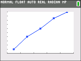
Cumulative Frequency Diagram
Note that L1 values are plotted on the x-axis and L3 values are plotted on the y-axis. |
|
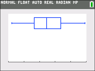
Box-and-Whiskers Plot
Note that the x-axis values span from 1.50 to 2.00 (the same scale that was used in the cumulative frequency diagram) and L4 was utilized to create this plot. |
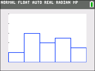
Histogram
Note that L1 values were used for the x-axis and L2 values were used for the y-axis (or the height of each bar). |
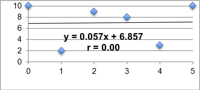
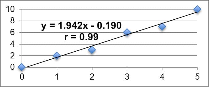
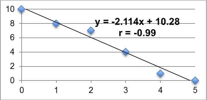
Often times we want to statistically analyze two data sets at a time and determine if there is a relationship between them. We call such data sets bivariate (as opposed to univariate). The relationship we are looking for between bivariate data sets is referred to as the correlation of the data sets. In this unit, we will look for linear correlation, or when the two data sets are related by a constant rate of change. We will look for linear correlation in data sets by creating scatter plots and calculating the product-moment correlation coefficient, or r. If r is equal to zero, we say there is no linear correlation between the two sets. The closer r is to positive or negative one, the stronger the linear correlation (positive or negative, respectively). It is imperative to remember that a correlation in data sets does not imply a causation, however, as the correlation could be a result of sheer coincidence or possible lurking variables. A common example I might give for this in my class is that when ice cream sales go up in the neighborhood, so does violence in the neighborhood. This does not necessarily imply that higher ice cream sales are the cause of more violence. Instead we might claim that we can establish a correlation between the two, but we would want to investigate other variables that might cause the increase in violence (my students typically respond that we should look into temperature). We utilize linear regression models (using a method called least squares regression) to fit data sets that have a strong linear correlation and algebraically explain the relationship between the independent and dependent variables. We will primarily utilize technology such as Microsoft Excel or Texas Instrument Graphing Calculators to find the equation for the linear model as well as the r-value. These models are useful in explaining observed patterns (interpolation) in the data set as well as making predictions outside of the observed data set (extrapolation). Table 3 below summarizes key examples of linear correlation, with the linear model relating the dependent variable y to the independent variable x; the r-value is also displayed on each. Each example was created on Microsoft Excel using my own data sets.
Table 3: Summary of Key Examples of Linear Correlation
|
No Linear Correlation |
|
|
Strong Positive Linear Correlation |
|
|
Strong Negative Linear Correlation |
|
Health in Chicago
When studying Chicago, we break the 237 square miles of the city into 77 community areas, some of which are single neighborhoods and some of which are multiple neighborhoods grouped together (there are over 100 neighborhoods total). Each of these community areas consists of approximately 35,000 of the city’s total 2.7 million residents3. The neighborhoods of Chicago reflect the diversity within the city, but also the segregation of the city by ethnicity, race, socioeconomic class, and in many ways, health. Much of this unit will focus on Community Area 61, or New City – an area consisting of the Canaryville neighborhood and the Back of the Yards neighborhood (where my school is located and many of my students reside).
In August 2011, the Chicago Department of Health rolled out “Healthy Chicago,” a multi-faceted plan to address health problems in the city. Utilizing available health statistics, this initiative set out to inform and recruit public, private, and community-based organizations to address pertinent health issues. Twelve main focus areas were decided upon: tobacco use, obesity prevention, heart disease and stroke, HIV prevention, adolescent health, cancer disparities, access to care, healthy mothers and babies, communicable diseases control and prevention, healthy homes, violence prevention, and public health infrastructure. With the ultimate goal of making Chicago the “healthiest city in the nation,” this program has worked over the past four years to remedy issues within each of the twelve key priorities, releasing progress updates and annual reports regularly4. As of the 2013 annual report, 92% of the work outlined in the Healthy Chicago initiative was in progress and/or had been completed. The success of the program at that point was attributed to the strong partnerships in the community (public and private), the variety of priorities that have been addressed in the policies, the positive role of social media and technology in informing the public, and the strength of other public awareness tools5. The June 2015 Implementation update provides examples of recent Healthy Chicago work, including the “Step Up. Get Tested” campaign’s goal to test 5,000 individuals at risk for HIV across the city during the month of June (addressing the HIV Prevention key priority). Under the Obesity Prevention key priority, it was noted that Chicago Public schools recently celebrated “Fresh Attitude Week” in which fresh fruits and vegetables, along with various vegetarian options, were provided in school lunches. Local farmers made visits to some schools in the city as well to increase student understanding of the local food system. Finally, this update detailed the work on “Healthy Chicago 2.0,” the update to the Healthy Chicago initiative with a rollout scheduled for 2016 6.
Beginning Analysis of New City Community Area
The Healthy Chicago program has helped to address and improve upon some of the health issues in community areas such as New City, yet there are still significant issues to be studied and addressed. First and foremost, it is important to understand the demographics of this population7. The New City area population has fallen 17% from 51,721 to 44,377 between 2000 and 2010. Almost half of the current residents are under the age of 25. Roughly one-third of the residents are living below poverty level, and 12.2% live in crowded housing situations. Approximately 57% of the residents are Hispanic, 30% are Black, 11% are White, and 2% are Asian9. This community area has a dependency rate of 42.0%, and 42.4% of the population has no high school diploma. The per capita income is $12,524 (well below the city average of roughly $28,000) and unemployment is 17.4%. When ranked and compared to other community areas in the city by these demographics, New City is definitively one of the most at-risk community areas. In fact, this community area has the 7th highest hardship index (91) in Chicago, a measure used to summarize the demographics listed above7.
Moving to a discussion of the health of this population, upon examining death rates, New City has rates that are especially high compared to the city average in assault (homicide), liver disease and cirrhosis, firearm-related, injury (unintentional), lung cancer, and diabetes-related. Overall, there is a higher death rate in males in New City, and the leading causes of death are cancer (all sites, but specifically lung cancer) and coronary heart disease. Shifting the focus to the prevalence of infectious diseases in New City, the number of cases reported for both chlamydia and gonorrhea in females per 100,000 is significantly higher than the rate reported for the city of Chicago as a whole7. It is important to note that there is a wide range of health-related data available for all Chicago community areas, particularly New City, on the City of Chicago’s official website8. Much of the data above will be utilized in instructional activities to support students in gaining comfort with measures of central tendency and dispersion, as well as measuring frequency. Furthermore, this data will serve to prompt students to identify areas of interest in their community that they will study more in depth with their teams.
If we examine the rate of lung cancer in the New City area further, there are many possible factors that might influence this high rate. Figure 1 below represents the prevalence of lung cancer in all 77 of the Chicago community areas, with the New City community area labeled with one of the highest rates7.
Figure 1: Adjusted Lung Cancer Death Rates per 100,000 Residents in 77 Chicago Community Areas (2006 – 2010)
(image 8)
When comparing this map with the map of percent below poverty level for each community area, I noticed similarities in shading patterns. Thus, I completed a linear regression analysis for a scatter plot of lung cancer deaths as compared to percent below poverty level for the 77 community areas in Chicago. Table 4 below illustrates this analysis, as well as additional analyses looking at gonorrhea cases in females and childhood blood lead level screenings as compared to percent below poverty level due to seemingly similar patterns upon investigating the prevalence of each. The approximate data point representing New City is marked “NC” in each graph. These analyses were performed by Excel utilizing data from the City of Chicago Data Portal8.
Table 4: Linear Regression Analyses for Lung Cancer Death Deaths per 100,000 vs. Percent Below Poverty Level (1), Gonorrhea Cases in Females per 100,000 vs. Percent Below Poverty Level (2), and Childhood Blood Lead Level Screening per 1,000 vs. Percent Below Poverty Level (3) in 77 Community Areas of Chicago
|
1. Lung Cancer Deaths per 100,000 vs. Percent Below Poverty Level |
|
|
2. Gonorrhea in Females per 100,000 vs. Percent Below Poverty Level |
|
|
3. Childhood Blood Lead Level Screening per 1,000 (0 – 6 yrs) vs. Percent Below Poverty Level |
|
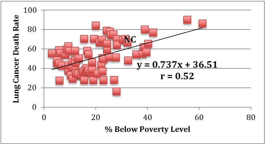
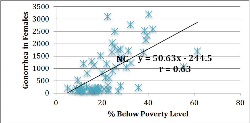
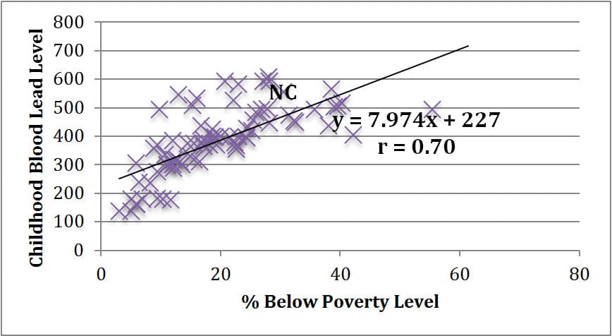
As evidenced in the linear regression analyses above, there is not necessarily a statistically strong linear correlation between percent of a community area below poverty level and lung cancer death rates (r = 0.52). There does, however, seem to be a general trend that as poverty level rises, so does lung cancer death rate. As a statistical comparison, there is a stronger positive linear correlation between poverty level and gonorrhea cases reported in a community area (r = 0.63), and an even stronger positive linear correlation between poverty level and child blood lead level screenings in a community area (r = 0.70). While we cannot claim that any of these three health issues are necessarily caused by poverty, it does seem reasonable to assert that living in a higher poverty neighborhood such as Back of the Yards in the New City community area puts one at a higher risk for death from lung cancer, contracting gonorrhea, and exposure to lead in children.
While the Healthy Chicago key priority of cancer disparities is seemingly focused on disparities in breast cancer (and therefore working to increase access to mammograms in impoverished community areas), the key priorities of tobacco use, adolescent health, access to care, and healthy homes should seemingly be targeting high incidence of lung cancer death rates. Depending on interest in lung cancer and other respiratory diseases, I might prompt students to investigate these priorities for resources and solutions. I will likely also prompt students to investigate pollution and toxicity in their neighborhood in addition to the areas listed above. The city of Chicago, and particularly neighborhoods such as Back of the Yards, are well known for many pollution issues both past and present.
It is important to note that the background information detailed above on the health of Chicago and the Back of the Yards neighborhood in the New City community area is not meant to be exhaustive. It is merely meant to set the stage for student inquiry and research into relevant health topics of their choice that they find to be prevalent in their neighborhoods. It will, of course, be important to discuss the quality of the data and the meanings of the measures used to describe and quantify health with students.
Comments: