Background Information
Basic vision
"We see in order to be able to acquire knowledge about this world." 2 Vision is truly an astonishing sense but one of the amazing things is that children are extremely accomplished at seeing before they can even walk. They can construct their world in three dimensions, navigate it, organize and recognize it as different objects and faces, and successfully grasp items. Parents don't teach children how to see and yet children learn to see, despite a fundamental problem with vision: "The image [retinal image] at the eye has countless possibilities." 3 Donald D. Hoffman argues that there are universal rules of visual processing and that these are part of everyone's biology. 4
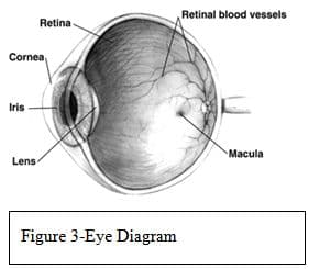
While vision is not the only way we acquire knowledge about the world, it is the most efficient way. There are certain types of knowledge that can only be acquired through vision, such as face recognition and colors. I imagine that it will come as a surprise to my students that the visual system does not merely send a fully formed image to our brain the way a camera sends an image to film or a computer. Light from an image enters the eye through the lens and travels through the eye to the retina (Figure 3). The light activates the rod and the cone photoreceptors, which then convert that light into an electrical signal that is sent to the brain via retinal neurons. As Margaret Livingstone said in a lecture given at the New York Academy of Sciences in 2006, "The function of the visual system is information processing, not image transmission. There is nobody up there to look at an image". 5
The major visual pathway, the optic pathway, carries the electrical signal from the retina to a specific area of the brain, the primary visual cortex (V1 for short, see Figure 1). There are different types of visual signals sent along this pathway including color, luminance, motion, form, and depth. Once in V1, the signals are passed to cells that are grouped according to what type of signal they receive. These cells are anatomically identifiable. These specialized cells send signals to further specialized visual areas, which are located in the large area of the cortex that surrounds V1. V1, in essence, acts as a distribution center for visual signals and leads to the specialization for each of the specific areas, depending on the type of signals that they receive. 6 Each of the areas has multiple connections with other areas; no area is only a receptor as each both receives and sends signals. In short, light enters the eye and is transduced into electrical signals at the retina and is then processed by a series of specialized parts of our brain. Each area seems to be constructed to extract different kinds of information.
First, the signal is sent to the back of our brain, the primary visual cortex, V1. Then it is sent to the second and third area, each one sequentially closer to the front of the brain. On a basic level, the visual system is one pathway. It goes from the eyes to the thalamus, in the middle of the brain, on its way to the visual primary cortex, located in the occipital lobe in the back of the brain. Then it moves to subsequently higher processing areas that are closer to the front of the brain. On a finer scale, this basic pathway is two distinct but interrelated visual pathways. "The two systems are anatomically distinct but interdigitated, and they carry different kinds of visual information, in parallel, from the retina to various hierarchal processing areas of the brain". 7
When the two interconnected visual pathways hit the primary visual cortex, in the back of the brain, they separate. The dorsal stream takes the information that it processes off to the right, to the occipital lobe, and then to the parietal lobe. The ventral stream takes information to the left to the temperal lobe. So, from the retina to the thalamus and through the early cortical areas, the two pathways are physically connected but they begin to separate at the primary visual cortex and continue to become physically more separated. Throughout these stages, whether physically connected or not, they keep the information that they carry separate.
The "where" system, encoded in the dorsal stream, is how we perceive where things are. This system deals with figure/ground segregations, spatial organization, motion perception and depth perception. It is color blind, in that it does not require any color perception to function. The "what" system deals with how we recognize what things are. This system deals with object recognition, face recognition, and color perception. The "what" system is located in the temporal lobe. The "where" system sees movement, such as a bouncing object, but the "what" system sees fine details such as shape and size. While these are two different systems with different functions and abilities, they function in conjunction with each other. Because of their different abilities and functions, they sometimes create illusions (perceptions that are not accurate) when they work together in a way that the brain does not expect or when they work against each other. This is what creates optical illusions and what some of the artists of the 1960's focused on when creating Op Art.
The two systems—"what' and "where"— are different in the ways in which they process light signals (images). The four fundamental differences are color selectivity, contrast sensitivity, speed and acuity, or resolution. The "where" system is colorblind. The "what" system needs the information about color and uses and carries color signals. The "where" system is sensitive to differences in brightness (contrast) while the "what" system is only sensitive to larger differences (lower contrast). The "where" system is faster, with quicker responses, than the "what" system. And finally, the "where" system has a slightly lower acuity or sharpness than the "what" system.
The major issue with the visual system is that what people see is not a camera image or a simple "looking" at an image on the retina. Therefore, how humans perceive the information that comes in through the retina, the way we actually process what we see, creates many interesting effects, effects that can and have been used in art and in optical illusions. This issue is related to the compression of visual information. We make assumptions, unconscious inferences, and conclusions based on prior experiences and these affect how we perceive the world. Optical illusions are instances when our assumptions or inferences actually go wrong.
Where System
The "where" system is the more primitive of the two visual systems. It deals with information about depth, spatial organization, position, figure/ground and motion. In other words, it deals with all of the aspects that a human or a primate would need to navigate his or her environment. Most animals have only the "where" system although there are a few animals that have both, such as certain squirrels and primates. Humans, as well as most mammals, navigate their environment using this system. People with lesions in this system can lose the ability to see movement, depth, or spatial organization.
Perspective: From 3D to 2D
The "where" system is the part of the visual pathway that is directly responsible for perspective. When we look at the world, we think we see a three—dimensional world. Yet the retina is a flat tissue. This flat tissue is what is sending the visual information to the brain. It is the brain that interprets the flat retinal image into what we perceive as a three—dimensional world. It is ironic that artists have the inverse problem. They must interpret the three dimensional world that they "see" into a two dimensional image. An obvious solution would be to paint the retinal image. But we don't have access to that retinal image. We don't "see" the world until the retinal image has been processed by the brain. 8 Though I previously spent a great deal of time studying and teaching how artists depict depth, before I began doing the research for this unit, I had never considered how the brain effects how we perceive depth. I did not appreciate that artists have discovered techniques to show depth in art that directly correlate to how the brain perceives depth.
I have always enjoyed teaching illusions of depth. In 6 th grade, the students do an important unit on the seven illusions of depth that artists have developed over time. They learn how artists create the illusion of three dimensionality on a two dimensional surface. As an assessment, the students create a painting that successfully illustrates five out of the seven techniques.
The seven techniques are:
1. Size — The larger an object is on a paper the closer it appears to the viewer. The smaller an object is, the further away it appears.
2. Position — An object closer to the top of a paper will appear farther away from the viewer. The lower it is on the picture plane, the closer it appears.
3. Overlap — When one object is put in front of another object, it overlaps. One can tell that the "whole" object appears closer because one can see all of it and the partially seen object is "behind" the front object.
4. Color (also called atmospheric perspective) — Colors in the distance appear to be lighter, more pastel. A good example is mountains seen at a distance appear a light bluish, purplish grey.
5. Details — Objects that are close—up have more details while objects that appear far away have less detail.
6. Shading — This technique works within an object. Lighter areas appear to be closer to the viewer while shaded areas appear farther away.
7. Linear Perspective — Mathematical perspective was discovered in the late 1400s. It deals with vanishing points and converging lines. With my 6 th graders, I introduce linear perspective and they learn how to do simple one point perspective with boxes.
The "where" system is the visual pathway that controls our depth perception. It has six cues that it uses to perceive depth. The brain automatically perceives these cues, even when we are not aware of them. In other words, it is an instinctual, subconscious processing that occurs in the brain without us being cognitively aware of it.
The six cues are:
1. Perspective — Perspective connects to three of the artists' illusions of depth: size, position and linear perspective. It results from the fact that all of the light from a visual scene must pass through one tiny opening in the eye, the pupil. Therefore, objects further away appear smaller and objects closer appear larger. Therefore it effects the relative position of objects. This is also why receding parallel lines always appear converging (linear perspective).
2. Shading — Gradations in light are reflected off an object due the shape of the object.
3. Occlusion — This simply means overlapping. It occurs when objects in the front block or occlude the view of objects that are behind them.
4. Haze — This is also know as aerial perspective or atmospheric perspective. I personally teach the concept as color. This is because, in reality, the intervening atmosphere is what changes the perceived color of distant objects, such as the mountains mentioned before.
5. Stereopsis —This is the perception of depth that is a result of having two slightly different images, one from each eye. The brain receives the slight differences as depth information.
6. Relative Motion — As one moves, the objects that are closer appear to move faster than the objects further away. The trees that are close to us move past us faster than the mountains in the distance. 9
I plan on teaching all six of these cues, noting, however, that there are two that artists typically do not use. Artists typically do not use stereopsis nor relative motion. While artists do use detail, or the lack of detail, to show distance, it is successful not because of the way the brain perceives depth, but rather because our eyes cannot see details in distance.
We will also focus on a variant of perspective, i.e. linear perspective. Because light travels in a straight line and because we only see light that travels in a straight line from an object through the pupil and into the retina, we perceive perspective as linear. It took a long time for this to be understood because our visual systems are so good at instinctually converting perspective information into depth information.
Most people do not consciously see receding parallel lines as converging. 1 0 I have taught linear perspective for years, and have noticed that students either "get" the concept or really struggle with it. I was one of those students who instantly "got" it, when I was taught it in 8 th grade. My best friend at the time, never got it, or at least not during that year, despite many frustrating classes spent trying to make her "see" it. I had always assumed that the differences between the students were simply due to differences in their development. Now, I am aware that it is their brain overriding what they see. This is new information for me and has changed the way I will think about teaching perspective.
Margaret Livingstone has hypothesized that artists who excel at depicting depth might actually be able to do so because they in fact have poor depth perception, thus seeing the world in a flat state, which makes it easier for them to depict it. 1 1 I am not sure I agree with this. My personal hypothesis, based on teaching hundreds of students how to see the world in terms of perspective, is that the students need to be developmentally ready to think about their own vision. As students get older, the ability to do this seems to increase. While maybe 25% of an average 6 th grade class might successfully understand perspective at the end of a unit, in 8 th grade the numbers are closer to 70%. I think it is their level of metacognition, the ability to analysis their own thinking, that makes the difference.
What System
The "what" system is the ventral stream and is the newer vision system in terms of evolution. It is responsible for object recognition, which includes face recognition and color perception. People who have lesions in this system can lose the ability to recognize objects, sometimes even very specific objects like faces, and/or color. This system is concerned with and can be subdivided into form and color. The color sub—system operates at a very low resolution. We have fewer cells in the color system (that is, there are many fewer cells in the retina that detect color than cells that detect light intensity) and those cells have much bigger fields of reception than cells in the form sub—system or in the "what" system. 1 2
Color Mixing
Color mixing that artists do (i.e. mixing paints) differs from color mixing that light does. Color mixing with light is an additive process, while color mixing with pigment is a subtractive process. In other words, when two complementary light colors are mixed, you get white light. 1 3 If you mix two complementary colors of paint you get brown. This occurs because we are not mixing light but in reality mixing the absorbencies of light of each color. When pigment is mixed, the molecules of each color are so physically close that neither individual color is reflected back. If you mix blue and yellow paint, the color reflected back is green because the light is hitting molecules of both colors at the same time. When working on the unit dealing with Pointillism, the students will need to understand this important difference.
Optical Illusions
When both visual systems can see an object, that object will be seen or perceived "normally." This is the case, of course, for the vast majority of things. The object will appear to be "correct", i.e. move appropriately, be three—dimensional and/ or appear to be stable. Problems, or from the point of view of artists, interesting things occur, when the two visual systems are not equal in their response to an object. This is what causes many optical illusions, especially color optical illusions.
Illusion of Movement
For many years, artists have been able to create the illusion of movement. The Impressionists were able to capture a shimmering quality in many of their paintings by using colors that have little or no value or luminance contrast. Value refers to the lightness or darkness of a color and luminance refers to the amount of light emitted or reflected from an object. For purposes of this unit, these terms, in effect, are synonyms. Since the "where" system cannot see the appropriate depth of these colors, the placement of the colors (which are seen by the "what" system) do not have a clear position or stability, and according to the "where" system, appear to jump or shimmer. When high value (luminance) contrast colors are placed next to low value (luminance) contrast colors, the juxtaposition leads to strong illusions of movement. This is what the artists of the Op Art Movement tapped into. Many Op Artists have used this technique, for example, Enigma by Isia Leviant and Bridget Riley's Fall.
Illusions of Depth
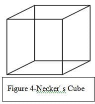
Hoffman states that the fundamental problem of seeing or perceiving depth is that the retinal image is two—dimensional and, therefore, has unlimited possible interpretations in three dimensions. Optical illusions occur when one of two things happen. Our biologically ingrained, subconscious dimensional processing perceives a solution to a visual problem that is in fact incorrect or has more than one possible correct interpretation. We have all seen optical illusions that illustrate the first option, i.e. perceiving a solution that is in fact incorrect (impossible objects are examples). A wonderful example of the second option, seeing more than one possible correct solution, is Necker's cube (Figure 4). Necker's cube is the three dimensional cube that is drawn so that it is see—through. Some people will see only one solution, typically the bottom, left corner is closer to the viewer, but many will find that once they see the two possibilities—either bottom, left corner is closer OR top, right corner is closer, the brain will bounce back and forth with the two equally correct possibilities.
Illusions of Color
I am not planning on focusing on all features of color with my students, because of the complexity of color. But I will deal with two small aspects of color: afterimages and Pointillism. Afterimages are optical illusions that occur when an image continues to be "seen" after the exposure to the original image has ended. For example, if you stare at the TV or a light bulb and then look away, you will see an afterimage of the object for a few seconds. Afterimages occur because of a retinal phenomenon that connects strongly to the color theory that I teach. I teach the color wheel and primary, secondary, warm, cool, analogous, tertiary, monochromatic and complimentary colors.
Five hundred years ago, Leonardo da Vinci wrote that the most pleasing colors are the ones that are opposites, i.e. complimentary colors. Artists have known about and understood complimentary colors for centuries. Yet just fifty years ago scientists discovered opponency, which is when cells in the visual system are excited or inhibited by the opposite color. For example, red is the compliment of green, so red and green are complementary colors. Opponency is when cells in the visual system that are excited by red are inhibited by green and vice a versa, and the same for yellow and purple, blue and orange and white and black. We now understand the biological reason for a phenomenon that artists have understood and used for centuries. 1 4, that complementary colors look brighter and more vibrant when next to each other
Afterimages reinforce what I teach about complementary colors. Afterimages are caused by the eye's photoreceptors. If one stares at an image for a long time, ten to twenty seconds, the photoreceptors become tired from being engaged. Then, when you look away, those photoreceptors that were engaged basically either stop working or send out a very weak signal to the brain. At the same time, the surrounding receptors that were not working are still fresh and are able to send out strong signals to the brain. Thus we "see" the image but in the opposite color. These opposite colors are known as complementary colors and are located across from their mate on the color wheel: i.e. yellow is across from purple, blue from orange, red from green, and, of course, there is also white and black.
The other aspect of color we will be looking at will be that of the work of the artists who worked in the style of Pointillism. While the Impressionists were successful in using the vision pathways to create effects in art works, the artists who worked in the style of Pointillism were the first to knowingly do this. Although there were several artists working in the style, I will focus on Georges—Pierre Seurat. Seurat was greatly influenced by a French scientist, Michel Eugene Chevreul. Chevreul designed the color wheel that is primarily used in art education (there are other versions, but his is by far the most common). Chevreul was a chemist working on restoring tapestries. He realized that he had to take into account the role of surrounding colors to create the dye to replace sections of wool. Through this discovery, he realized that two colors next to or slightly overlapping each other could appear to be a different color, when seen from a distance. This became the basis of Pointillism.
Seurat was fascinated by this idea and set out to prove that the scientific application of color is critical in art. He spent his life trying to prove that tiny dots of colors allow the eye to blend colors optically, creating a more natural state than the blending of colors in paint applied to the canvas directly. Livingstone argues that the techniques of Pointillism do not work because our vision pathways don't work that way. The resulting Pointillist colors are grayish and the pearly effect that many pointillist paintings have are due to larger color dots, which cause the eyes to read them as shimmery. 1 5 While I understand her reasoning, it is hard for me to let go of what I was taught as an art history major: i.e. that Pointillism does work the way it was intended and that our brain does blend the two colors thereby making a new color. Regardless of the science behind it, I want my students to understand this important art history period as the first time that artists began to rationally use the way the brain processes to create effects.
Art History
For centuries, artists have been exploring how we see. In fact, artists have been studying vision longer than neuroscientists. Artists have always been concerned with depicting the three—dimensional world on a two—dimensional surface. In the 14 th century, linear perspective was discovered. Use of color became very important as a tool beginning with the Impressionists, even though they did not understand the science behind the color effects that they achieved.
The "where" system is colorblind and the "what" system sees color and luminance (value). While the "what" system sees a green dot on a red background, the "where" system sees a grey dot on a grey background. Depending on the brightness of the red and green, the "where" system could see the two greys as being identical. When this happens some weird visual effects are created, e.g. shimmering and jittering. The Impressionists were the first to use this effect successfully in art. A wonderful example of this is Monet's painting Impression Sunrise. The sun does appear to shimmer because it is the same value as the background (not lighter as one would expect from the sun). The fauves also used this effect (albeit after the Impressionists) with shadows. They discovered that it really does not matter what color a shadow is as long as it is the right value (the lightness or darkness of a color). If it is the right value, it will create a realistic shadow, which in turn creates a realistic sense of form. An example of this is Matisse's Lady in a Hat, where the colors of the face are completely unrealistic but since the values of the colors are correct, the face retains the correct form. Matisse accomplishes what Picasso did in The Tragedy, Poor People by the Seashore, that is to use value to define reality (form) and color symbolically. Picasso, in fact, said, "Colors are only symbols. Reality is to be found in luminance alone."
Another example in art that shows the contradiction between the "where" and the "what" system is Mondrian's Broadway Boogie Woogie. The painting seems to jitter, or vibrate because the "where" system cannot see the yellow squares but the "what" system can. Since the color is seen but the position is not, they seem to jitter. 1 6
Artists have used depth for thousands of years before the rules of linear perspective were discovered in the early years of the Renaissance. In the early 1400s, Filippo Brunelleschi developed the linear perspective that has been used by artists since. The purpose of perspective to is show objects as they appear, not as they are. Because of this, problems arise. Some artists, once they understood the rules of perspective, began playing with it. An early example of this is William Hogarth's Satire on False Perspective, created in 1754. This image can be classified as an impossible object. An impossible object is an optical illusion that consists of a drawing (or other two—dimensional images) that is instantly, and perhaps more importantly, subconsciously recognized by the "what" system as a three dimensional object even though it is not possible for that object to actually exist. Often the impossibility becomes obvious after considering the object for a few seconds, although sometimes one must consciously examine the object to figure out that it is impossible. M.C. Escher is famous for his impossible objects.
Op Art is a movement that originated in the 1960s, which tried to create an illusion of movement and depth on the picture plane. Op Art became famous in 1965 when the Museum of Modern Art, in New York City, held an exhibition called "The Responsive Eye." While panned by critics, the public loved it and thereby created one of the most popular art movements. Op Art has appeared in everything from fashion and design, from dresses to wallpaper. Perhaps the two most important Op Artists are Victor Vasarely and Bridget Riley.
Once one becomes aware of optical illusions, whether tied to movement, depth, or color, one will begin to see them everywhere. I believe that once one begins to think about how and why optical illusions work, one will never look at them in the same way. And this understanding of how and why they work will open windows to the brain.
Comments: