History of the Food Pyramid
In 1916 the USDA released the first dietary guidelines, Food For Young Children by Caroline Hunt. It included five basic food groups: milk and meat, cereal, vegetables and fruits, fats and fatty foods and sugars and sugary foods. In 1917 they produced How to Select Healthy Foods, a similar guide for adults. During the depression they provided advice on which foods were economically sound choices. In1941 they developed the Recommended Dietary Allowances, similar to what we see today on many nutrition labels. In 1943 they developed the National Wartime Nutrition Guide, a piece of propaganda to make citizens feel that by eating in a certain way they were helping the war effort.
During this period of time, the dietary guidelines moved from five groups to seven groups: milk, vegetables, fruits, eggs, meat (with cheese, poultry and fish), bread (and cereal) and butter. This was the earliest graphic I found in my research - a wheel showing those seven categories in equal pieces, on a variety of different materials. I believe that this is an important graphic to show my students when looking at "food pyramids." I would like them to see different versions of the US graphic, so that they understand that the food guidelines are constantly changing and being updated - they are not static. In 1956 they were cut back to four groups again (milk, meat, vegetable and fruit, and bread and cereal) and there was no longer the appearance of a graphic. In 1979 they produced the Hassle Free Guide, which again included five groups and fats and sweets were given their own category. In 1984 they created the food wheel - a graphic that showed the proper servings of seven different food groups. Finally, in 1992 the food pyramid, which most of my students grew up with, was introduced. It showed daily servings of five different food groups. I think it is also important to include this graphic in those that my students are comparing because I think it is the one they will be most familiar with. Most recently, within the past few years, the USDA has introduced an entirely new graphic that provides no visual guidelines, however the pyramid has stairs added to the top of it with a person climbing them, to emphasize the importance of exercise. 1
In addition to these three specific USDA-created graphics, I will also ask my students to study some dietary graphics from other countries to realize there are other diets besides the Western diet. I would like to use this as a springboard to start a conversation about who creates these graphics, what information is used to support them, why they might be altered, why they might be different for different regions, what composition is easiest to understand, what information can you easy determine from each graphic, etc.
Seven Basic Food Groups (1943)
The Seven Basic Food Groups graphic is a circle divided into seven equal parts. Each slice of the circle is a different color and contains a different food group. There is a small line drawing of different types of food in that group in each slice as well. Written under each image is a list of different foods in that group, and the recommended daily allowance. In the center of the circle is a USDA graphic along with the slogan Eat the Basic Seven Groups a Day. 2

The Food Wheel (1979)
The Food Wheel is also a circular graphic with a fork and knife on each side of the circle. It is again divided into pie sections, but the size of each section varies depending on the daily recommend allowances, though the divisions are not mathematically correct. Towards the center of each pie piece the recommended daily allowances are listed. For instance, the 6-11 servings of bread, grain and cereal take up about the same amount of space as the 2 servings of cheese, yogurt and milk. Alcohol, fats and sweets do have smaller slices than the rest. Each slice s a different color, and coming out from the slices are colored illustrations of examples of foods that constitute that food group. With this graphic I will stress to students that the choices made by the designer in breaking up the shape is extremely important. In this graphic it appears that by the fraction that each group takes up you should be consuming equal amounts of those food groups, when in reality that is not the case. 3
Food Pyramid (1992)
This graphic is the one my students will be most familiar with, since it has been around most of their lives. It is a different shape than the other two we've looked at. I will ask my students to think about how the pyramid graphic differs from the circles, and think about which is easier to read. The pyramid is divided into four horizontal levels, with sugars and fats at the top and grains taking up the entire base. Each group again has an illustration of foods that represent that particular group. A line points to each division and lists examples of foods, which can be found in that group, and also lists the recommended daily allowances. The entire pyramid is black with a white line between the divisions (note that each section no longer has its own color). At the top there is a key explaining the symbols for fats and sugars, which can be found in the top layer and also throughout the other divisions. My focus for the students in looking at this graphic will be the different shape of it. 4
My Pyramid (2005)
08.06.09.04
The new graphic is still a pyramid, but it has been simplified. It is divided vertically instead of horizontally and each section is now a different color. There are stairs added to the left of the pyramid and a person climbing them. This is the first guide to include a reference to exercise, and the first to make no mention of specific food groups. There are no foods, no lists of food groups, and no recommended daily allowances. I would like students to talk about whether or not this is an effective graphic. A website is listed at the bottom - mypyramid.gov. This new pyramid relies on the fact that the eater has access to the Internet, where s/he can go to design a pyramid specific to him/herself. While this can be a powerful tool I would like to use this graphic as an example of keeping your audience in mind when you are designing. Does everyone who should be able to use the pyramid have access to a computer? In what way does this limit the success and usefulness of the guide? 5
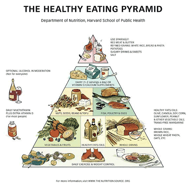
Harvard Public School of Health's Pyramid (2001)
08.06.09.05
This graphic is very similar to Willet's Healthy Eating Pyramid, and is easily accessible online. It looks similar to the USDA's old graphic. It is a pyramid with horizontal divisions with fats and sweets at the top; however, the bottom broad category is now exercise and weight control. The recommended daily servings are very different with grains having much smaller servings and healthy fats and oils having their own division. The alcohol portion of the pyramid should be removed when making copies. 6
Canadian Guide
08.06.09.06
Canada's Food Guide takes a different form than most of the other food guides I've researched. It takes the form of a rainbow with only four categories. Each category contains small drawings of foods in that category. In the largest band fall fruits and vegetables, the second largest band is grains, the next is dairy and the last is sweets, fats and meats. It is easy to read and straightforward. There are no words, or recommended daily allowances, but the message is clear. 7
Korean Guide
08.06.09.07
The Korean Guide is in the form of a pagoda, with each tier containing drawing of different foods. There are five tiers with grains on the bottom tier, which is also the largest. The next tier is fruits and vegetables, followed by meat and dairy. Above that are dairy products and at the very top in the smallest amounts are fats and sweets. There is writing to the right of the pyramid, which I assume lists food and dietary allowances. 8
Mediterranean Guide
A copy of the Mediterranean graphic can be found at: http://www.seve.gr/sevedetrop/defaulten.htm. The Mediterranean Guide is a pyramid structure, but it has nine different horizontal divisions. The top of the pyramid or the smallest amount, which is recommended monthly, shows a drawing of red meat. Then there are four layers in the "weekly" column, with one food on each layer: pie, eggs, chicken and fish - in that order. It reads as though you should it more of each food as you go down the pyramid. Then there are four divisions in the everyday portion of the pyramid. The top portion of the everyday section contains an image of dairy, the second layer contains olive oil and wine, the third layer contains fruits, vegetables and rice, the bottom layer (indicating foods that should be eaten the most) contains potatoes and grains. The food is organized much more specifically in this pyramid since it has more divisions. It also contains very different recommended foods than the United States pyramid. 9
After students have compared each graphic as a means of relaying information visually, I will have them compare the recommended daily allowances of each food group. We will discuss the similarities and differences and try to examine why the food recommendations might be different for different cultures. We will create a graph showing where each food group appears on the different guides for comparison. This will lead us into a discussion about what a healthy diet involves.
Comments: